FoodMiner.
An AI shortcut inside Uber Eats for the moment you're hungry but can't decide. AI narrows the choice to five picks, you catch one, and a deal takes you straight to checkout.
- My role
- Journey analysis, AI product mechanism, information architecture & high-fidelity prototype
- Context
- Hack4Her 2026, Uber Eats challenge
- Team
- 3 people: two interaction designers and one engineer
- Outcome
- Top 3 of the challenge



Summary
People open Uber Eats ready to order, then lose momentum scrolling and comparing. Too many good options become decision fatigue.
Let AI take on the low-value filtering, so people only make the final choice.
AI builds a pool of five personal picks. You catch one, a deal unlocks, and you go to the order.
Top 3 at Hack4Her. Built around two targets: less time to decide, more intent to order.
What I did
3 contributionsUser journey & AI opportunity
Mapped the whole path from opening Uber Eats to placing an order, found where people loop in Explore and Compare, and redefined the opportunity as letting AI do the filtering.
ProblemRecommendation mechanism & loop
Designed how AI enters the decision: order history, preferences and restaurant data produce five personal picks, inside a compute, choose, reward loop that keeps the user in control.
MechanismMVP prototype & validation
Owned the information architecture, interaction flow and high-fidelity prototype, framed the value hypotheses, and tested them in the Hackathon demo.
Prototype
React 19TypeScriptViteLottiePythonFastAPIPydanticSQLiteAWS AmplifyECS Fargate
Product decisions & metrics
Defined for a real test- Decision 01AI filters, people choose.
Appetite and mood live in the moment, so the AI never orders on anyone’s behalf. Trade-off: one tap more than a fully automatic pick, in exchange for trust.
- Decision 02Five picks, one catch a day.
The limits are what make it faster than browsing, and stop it turning into a slot machine. Trade-off: less time spent in the feature, on purpose.
- Decision 03One entry on the home screen, nothing removed.
It starts where the habit already starts, so there is nothing new to learn. Trade-off: it competes with existing banners for attention.
Share of Food Miner sessions that end in an order.
- Time from app open to first committed choice
- Return rate for the next day’s catch
- Perceived control after choosing
- Deal cost per extra order
The Hackathon demo ran on mock data, so none of these are measured yet.
Hunger wasn't the problem. Choosing was.
People opened Uber Eats ready to order, then lost momentum inside an abundance of plausible options. The effort moved from finding food to managing uncertainty.
I mapped the journey from opening the app to completing an order. The greatest friction appeared before checkout: repeated scrolling in Explore and repeated comparison between restaurants, dishes, prices, and delivery conditions.
More information did not create more confidence. It increased the number of decisions a hungry person had to make before reaching the decision that actually mattered.
For Uber Eats, the same hesitation risks longer sessions without an order: more re-checking, more drop-off, and fewer high-intent visits reaching checkout.
Uber's challenge: design a playful feature that helps people decide what to eat next, and unlocks a personalised deal when they do.
Three frictions in Explore and Compare
From the journey map- Repeated browsing
The same restaurants come round again and again while scrolling, without bringing the decision any closer.
- Information overload
Every card carries price, fee, rating, time and promo. Each is useful on its own; together they slow people down.
- Hard to commit
With many acceptable options, choosing one means giving up the others, so people keep checking instead.
Reduce decision debt before it becomes drop-off.
- Filter repetition
Let AI absorb broad exploration and comparison.
- Protect judgment
Keep appetite and intuition in the user's hands.
- Reconnect to checkout
Turn a confident choice into a clear next action.
Let AI do the filtering. Leave the choice to people.
The opportunity was not to let AI order on someone's behalf. It was to compress the least rewarding work and protect the moment of agency.
I split the decision into three jobs: exploring what's available, comparing the good candidates, and picking one. The first two are broad and repetitive, which suits a machine. The third depends on appetite and mood in that moment, which only the person knows.
Who does what
Design principleAI owns the breadth
Reading order history and preferences, checking restaurants, price and delivery, and cutting hundreds of options down to five.
You own the commitment
Choosing between five options that all fit, on appetite and mood. The final tap is always yours.
The flow, rebuilt
Product definitionBrowse, compare, go back, compare again, then choose. All by hand.
AI screens the options. You make one decision.
Five picks, one catch, one reward.
Food Miner turns recommendation into a short, playful decision loop: the system computes a compact pool, the user catches one option, and a reward confirms the action.
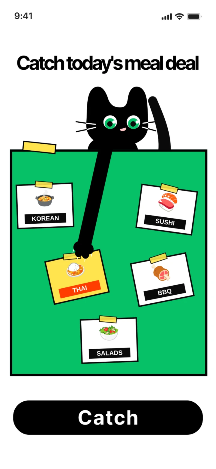
Choosing is an action, not a scroll. A cat's arm swings over the pool and you tap to catch the card you want. The system has already done the filtering, so the catch is a real choice between good options.
- 1
Compute
Read history, preferences, restaurant context, price, and delivery fit.
- 2
Surface five
Balance familiar choices with a controlled amount of discovery.
- 3
Hook one
Turn the final selection into a quick, user-led action.
- 4
Reward
Unlock a deal and carry the chosen dish into the order flow.
Each catch and order feeds back into the next pool.
How the five are scored
Weighting in the Hackathon build- 45%Order history
Cuisines, dishes and price ranges you keep coming back to.
- 20%Campaign fit
Offers currently running that match the pick.
- 15%Restaurant need
Restaurants that want orders now, so the deal helps both sides.
- 10%Price fit
Close to what you usually spend.
- 10%Delivery fit
Open, nearby and quick enough right now.
Two rules that keep it useful
Pool and pacing- PoolFamiliar plus discovery
Most of the pool is food you already like; the rest is close to it but new. Relevant without repeating last week's order.
- PacingOne catch a day
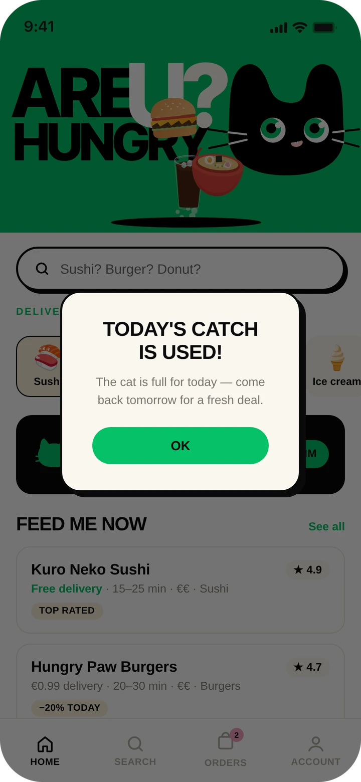
After a catch the game closes until tomorrow. It stays a shortcut to dinner, not a slot machine to keep pulling.
Embedded in the flow, not added beside it.
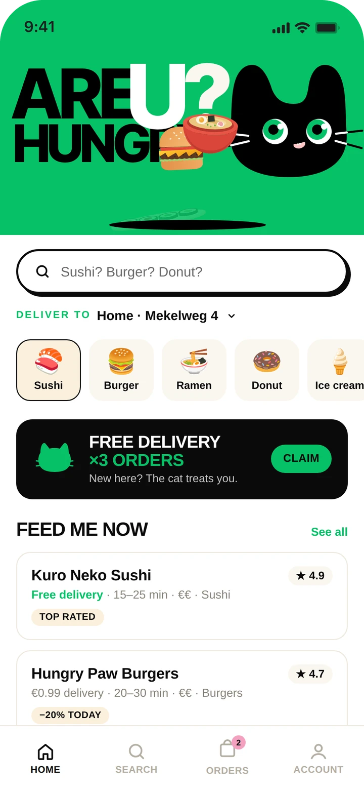
The MVP starts where the existing habit already starts: the Uber Eats home screen. Food Miner becomes a new decision shortcut, not a separate destination to learn.
I designed the product structure, interaction sequence, and high-fidelity prototype from problem definition through the Hackathon demo.
The visual language borrows Uber Eats' directness, then adds a playful catcher and a vivid green interaction field to make the AI moment obvious without breaking the surrounding product.
Home entry AI screening Catch Deal Order
Where it sits
Information architecture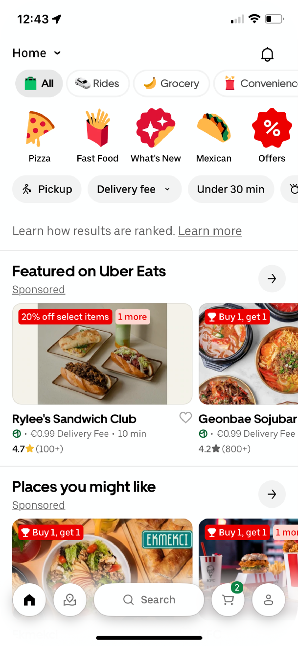
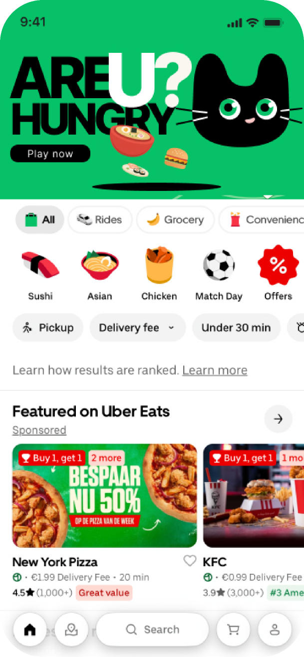 Food Miner
Try it here
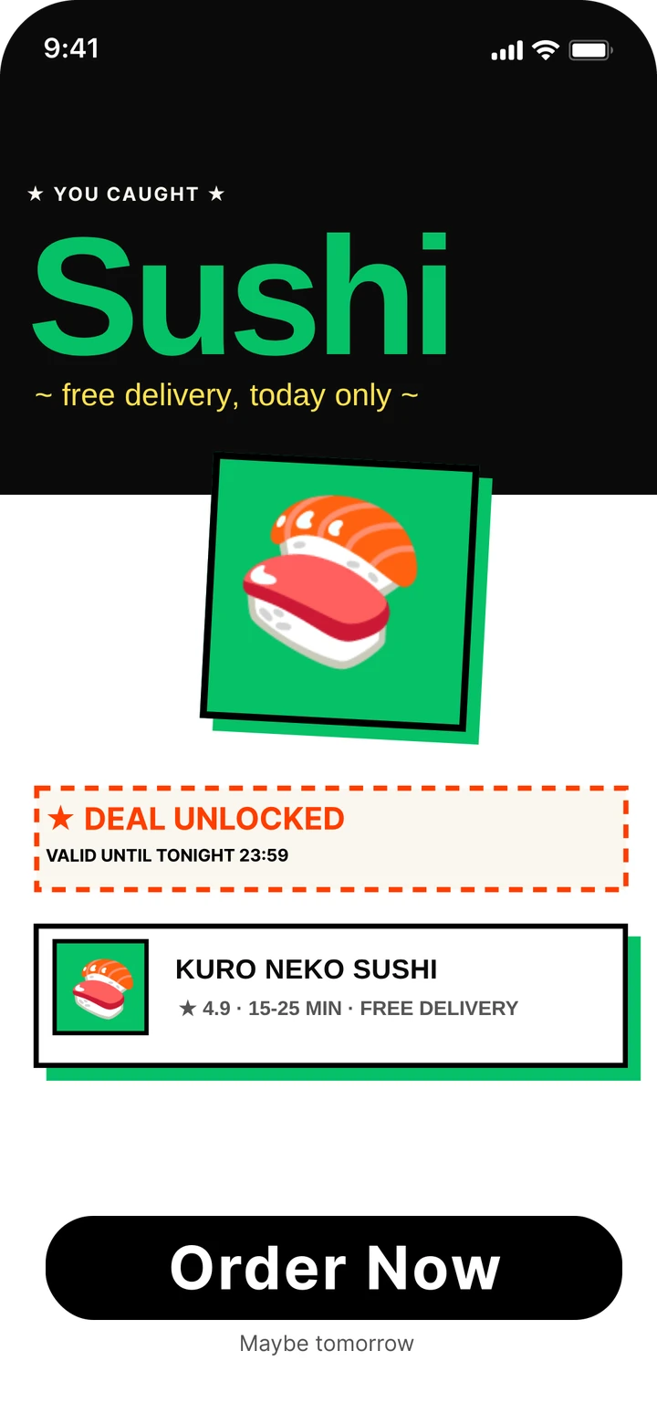
This is the prototype we demoed at Hack4Her. Tap the green banner, wait for the dig, then tap Catch when the arm is over the card you want.
- EnterTap “Are U hungry?” on the home screen
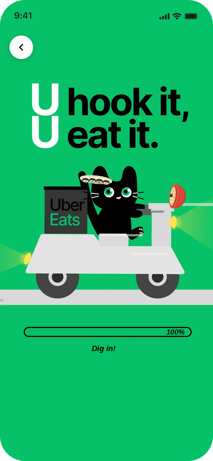
- ScreenAI digs through the options
- ChooseCatch one card
- RewardYour deal, ready to order
Enter
From the home screen to a ready pool in a few seconds.
Choose
The only decision left for the user.
Reward
A clear next step, and a clear end.
How it was built
Working MVPFront end
React 19, TypeScript and Vite, with Lottie for the dig and catch animations. Deployed on AWS Amplify.
Back end
Python and FastAPI with Pydantic models and SQLite, running on ECS Fargate. It scores the options and returns the five-pick pool.
Test the value before the model.
Placed in the top three with a working demo, judged on originality, UX, personalisation logic, execution and pitch.
Before building a better model, the demo had to answer a product question: does a short, AI-curated choice feel faster, while still feeling like your own decision?
I wrote the value down as three hypotheses, each with what the demo could show and what we would measure in a real test.
Value hypotheses
Core metricsExplore and Compare fold into one pool of five.
Time from app open to first committed choice
A deal turns the pick into a clear next step.
Entry to checkout conversion
AI proposes; the person still makes the catch.
Perceived control after choosing
What I'd test next
Next iteration- Is five the right number?
Compare pools of three, five and seven across different levels of hunger and dietary needs.
- Show why a pick appeared
A short reason on each card, so people can understand and adjust the recommendation.
- Against the normal flow
An A/B test of Food Miner against browsing, on decision time and order completion.
Hackathon demo with mock data · results are directional, not a live experiment
Good AI removes effort, not agency.
The best AI shortcut does not make the decision invisible. It makes the meaningful part of the decision easier to own.
- Limits do the work
Five picks and one catch a day are what make Food Miner faster than browsing. Every extra option or extra round would quietly bring the scrolling back, so the constraints are part of the product, not a missing feature.
- Play has to carry the decision
The game only earns its place because the catch is the choice. If the playful layer had just decorated the flow, it would have added one more step between being hungry and checking out.
- Show where the AI stops
The system filters and the person decides, but that line should be visible. Next time I would give every pick a short reason, so trust doesn't depend on guessing what the AI did behind the scenes.